IS-LM-PC Model
by Professor Throckmorton
for Intermediate Macro
W&M ECON 304
Slides
Summary
Okun’s Law: negative relationship between output, , and the unemployment rate,
Real vs. nominal interest rate and the medium-run IS-LM-PC equilibrium
IS-LM-PC: short-run vs. medium-run equilibrium
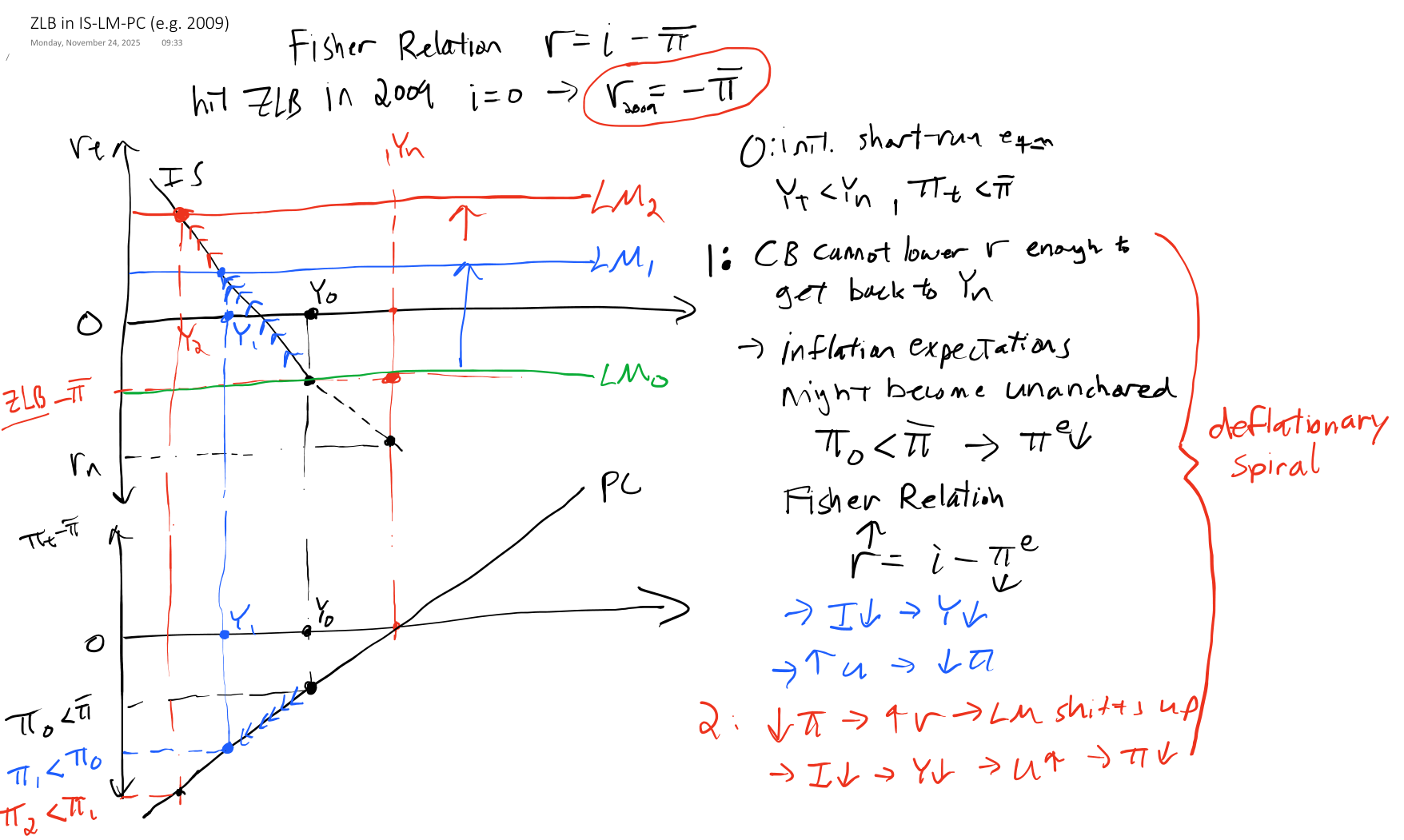
Q: What does a recession look like in the model?The ZLB and Deflationary Spirals
Okun’s Law
IS-LM model is in the space, but Phillips Curve is in the space.
To combine IS-LM and PC, we will first transform the PC into the space.
To do that, we need Okun’s law, which is a negative relationship between output, , and unemployment rate, , relative to the medium-run equilibrium
Recall these labor market definitions: and
For the labor market, we assumed the production function is , so we can also substitute out for ,
i.e., unemployment rate and output are negatively related (by definition)
Rearrange and add time subscripts (assuming is constant in short run)
Note that equation also holds in the medium run, , i.e., the natural unemployment rate implies a natural, or potential, output level.
Subtract the medium-run equation from the short-run equation:
This is Okun’s Law.
Substitute Okun’s Law into Phillips Curve
Inflation vs. Output
Again, suppose , i.e., expectations are anchored, and the central bank is credible
If (eqm), then is stable at the Fed’s target
If (recession), then falls below the Fed’s target
If (boom), then rises above the Fed’s target
This version of the Phillips Curve appears in the IS-LM-PC model and is equation 9.4 in Blanchard, Macroeconomics (9th Edition, 2025).
Real vs. Nominal Interest Rate
Recall the simple loan example from the Money Market. Suppose you lend me dollars, and next year I will pay you back
where the nominal interest rate, , we agree on ahead of time
Q: What is the real value of that future payment today?
A:: expected price of goods and services next year
: the real interest rate (in terms of goods, not dollars)
Problems: It’s not in terms of the inflation rate. And it’s a nonlinear relationship, which is difficult to use/interpret.
Substitute in inflation rate
Recall the definition of the inflation rate
Combine that with real interest rate
Nonlinear linear
Recall the properties of natural log
Take natural log of both sides
Note are small
Approximate (since is small)
i.e., the real interest rate equals the nominal rate minus expected inflation
Fisher Relation Examples
Fisher Relation
Note that in the U.S.
2008-2015: Suppose and (annual rates)
Note the real interest rate can be negative!
Great Depression: and (deflation)
Note that the real interest rate can be greater than the nominal rate, and that really hurts borrowers! (debt deflation)
Data Example
Source
# This script began as a copy-paste from a previous script in this book
# Then it was modified with the help of GitHub Copilot
# Finally, it was manually edited for accuracy and aesthetics

# Libraries
from fredapi import Fred
import pandas as pd
# Read data
fred_api_key = pd.read_csv('fred_api_key.txt', header=None).iloc[0,0]
fred = Fred(api_key=fred_api_key)
data = fred.get_series('DGS10').to_frame(name='10Y Treasury Yield')
# append unemployment rate to data
data['10Y TIPS Yield'] = fred.get_series('DFII10')
# append difference column to data
data['Expected Inflation Rate'] = data['10Y Treasury Yield'] - data['10Y TIPS Yield']
# append PCE core price index
data['PCE Core'] = fred.get_series('PCEPILFE')
# reindex data to QE by averaging quarterly
data = data.resample('QE').mean()
# append inflation rate year over year percent change
data['Actual Inflation Rate'] = data['PCE Core'].diff(4) / data['PCE Core'].shift(4) * 100
# remove data before 2003
data = data[data.index.year >= 2003]

# select variables to plot
plot_me = ['10Y Treasury Yield', '10Y TIPS Yield', 'Expected Inflation Rate']
# create list with 3 line types, one for each column
line_types = ['--b', '--r', '-k']
# plot all columns of data with loop
import matplotlib.pyplot as plt
plt.figure(figsize=(8.5,4))
for i, variable in enumerate(plot_me):
    plt.plot(data.index, data[variable], line_types[i], label=variable)
plt.xlabel('Year')
plt.ylabel('Annual Rate')
plt.legend()
# add grid lines
plt.grid()
# orient legend horizontally and relocate to outside top center
plt.legend(loc='upper center', ncol=len(data.columns), bbox_to_anchor=(0.5, 1.15))
# set xlims to 2003-04-01 to 2022-03-31
plt.xlim(pd.Timestamp('2003-04-01'), pd.Timestamp('2026-03-31'))
# add % to ylabels
plt.gca().yaxis.set_major_formatter(plt.FuncFormatter(lambda y, _: '{:.0f}%'.format(y)))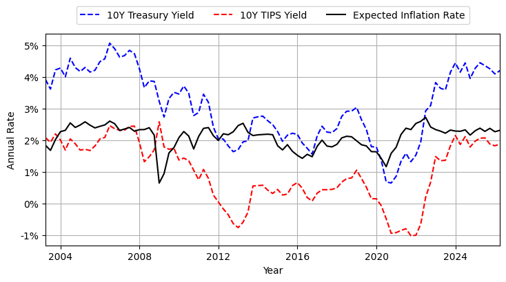
10Y TIPS principal is indexed to inflation, so price is higher than 10Y (non-indexed) Treasury and yield is lower.
Difference in yields is a measure of expected inflation rate (which is an application of the Fisher relation)
Implied expected inflation rate is usually the Fed’s target of 2%
Source
# select variables to plot
plot_me = ['Expected Inflation Rate','Actual Inflation Rate']
# create list with line types, one for each column
line_types = ['--b', '-k']
# plot all columns of data with loop
import matplotlib.pyplot as plt
plt.figure(figsize=(8.5,4))
for i, variable in enumerate(plot_me):
    plt.plot(data.index, data[variable], line_types[i], label=variable)
plt.xlabel('Year')
plt.ylabel('Annual Rate')
plt.legend()
# add grid lines
plt.grid()
# orient legend horizontally and relocate to outside top center
plt.legend(loc='upper center', ncol=len(data.columns), bbox_to_anchor=(0.5, 1.15))
# set xlims to 2003-04-01 to 2022-03-31
plt.xlim(pd.Timestamp('2003-04-01'), pd.Timestamp('2026-03-31'))
# add % to ylabels
plt.gca().yaxis.set_major_formatter(plt.FuncFormatter(lambda y, _: '{:.0f}%'.format(y)))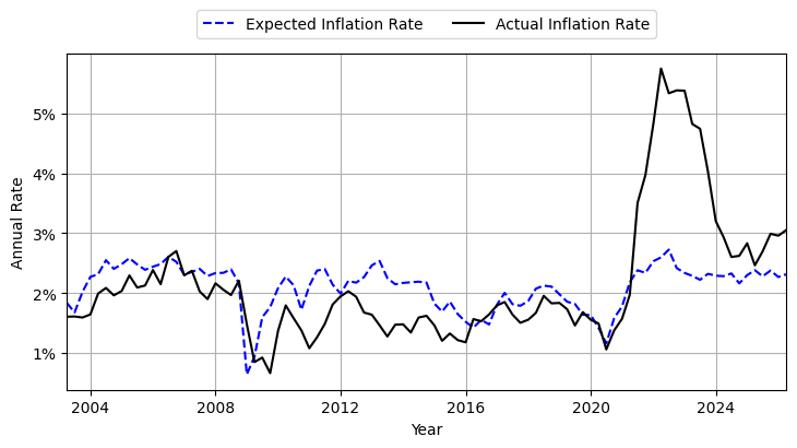
Goods Market in medium-run
Medium-run equilibrium defined by (Labor Market, PC, and Okun’s Law)
Substitute into goods market short-run equilibrium
Note investment is function of real interest rate.
Assuming , , , and are fixed, then the only other variable in equation is . Thus,
in a medium-run equilibrium.
is the natural real interest rate, often called the “neutral rate” since when .
IS-LM-PC Graph
Source
# This script began as a ChatGPT-5.1 translation of a hand-drawn figure
# It was then modified with the help of GitHub Copilot
# It was then manually edited for accuracy and aesthetics
import numpy as np
import matplotlib.pyplot as plt

# Set up figure
fig, axes = plt.subplots(2, 1, figsize=(6, 6))

# -------------------------
# 1. IS–LM diagram (top)
# -------------------------
ax1 = axes[0]

# Axes limits
xmax = 10
ymax = 6
ax1.set_xlim(0, xmax)
ax1.set_ylim(0, ymax)

# Remove ticks
ax1.set_xticks([])
ax1.set_yticks([])

# Draw axes manually
#ax1.axhline(0, color='black', linewidth=2)
ax1.axvline(0, color='black', linewidth=2)

# Equilibrium point
Yn = 5
rn = 3

# Vertical red line at Yn
ax1.axvline(Yn, color='red', linestyle='--', linewidth=1.5)

# IS curve
Y = np.linspace(1, xmax-1, 100)
IS = rn - 0.7*(Y - Yn)
ax1.plot(Y, IS, color='black')

# LM curve
LM = rn + 0*(Y - Yn)
ax1.plot(Y, LM, color='black')

# Equilibrium point
ax1.plot(Yn, rn, 'ko')

# Labels
ax1.text(xmax+.2, -0.5, "$Y_t$", fontsize=12)
ax1.text(-0.7, 6, "$r_t$", fontsize=12)
ax1.text(8, rn+.2, "LM", fontsize=12)
ax1.text(8, rn-2, "IS", fontsize=12)
ax1.text(Yn + 0.1, 5.5, "$Y_n$", color="red", fontsize=12)
ax1.text(Yn, -0.5, "$Y_n$", fontsize=12, ha='center')
ax1.text(-0.3, rn, "$r_n$", fontsize=12, va='center',ha='right')

# -------------------------
# 2. Phillips Curve diagram (bottom)
# -------------------------
ax2 = axes[1]

# Axes limits
ax2.set_xlim(0, 10)
ax2.set_ylim(-5, 5)

# Remove ticks
ax2.set_xticks([])
ax2.set_yticks([])

# Draw axes manually
ax2.axhline(0, color='black', linewidth=2)
ax2.axvline(0, color='black', linewidth=2)

# Vertical red line at Yn
ax2.axvline(Yn, color='red', linestyle='--', linewidth=1.5)

# Phillips curve
PC = 0 + 1*(Y - Yn)
ax2.plot(Y, PC, color='black')

# Equilibrium point
ax2.plot(Yn, 0, 'ko')

# Labels
ax2.text(xmax+.2, -1, "$Y_t$", fontsize=12, va='center')
ax2.text(-.3, 5, r"$\pi_t-\bar{\pi}$", fontsize=12,ha='right')
ax2.text(8, 3.8, "PC", fontsize=12)
ax2.text(Yn, -1, "$Y_n$", fontsize=12, ha='center')
ax2.text(-.3, 0, "0", fontsize=12, va='center',ha='right')

# remove upper and right box from both plots
for ax in axes:
    ax.spines['top'].set_visible(False)
    ax.spines['right'].set_visible(False)

# remove bottom box from bottom plot
axes[1].spines['bottom'].set_visible(False)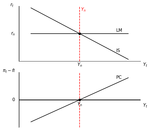
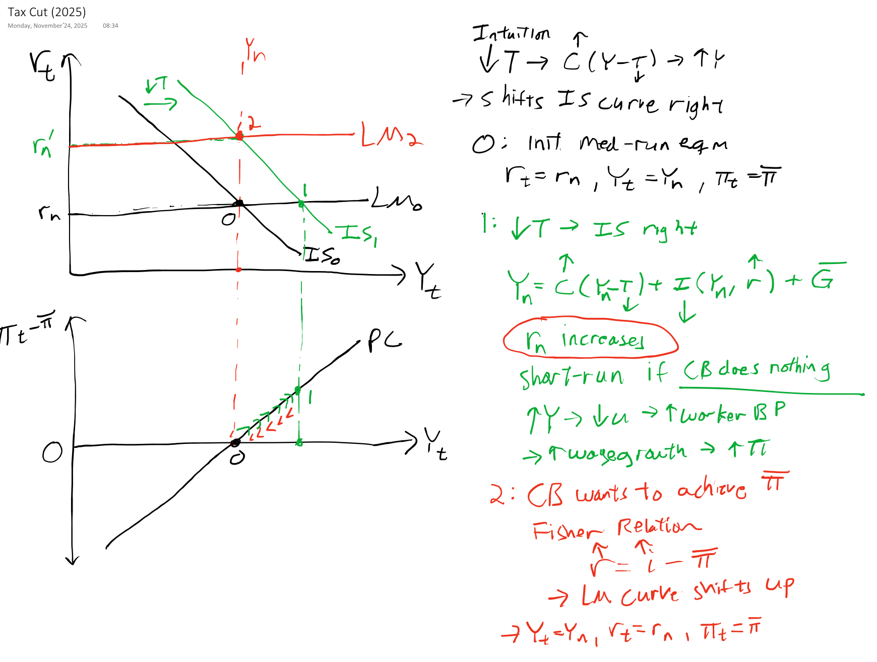
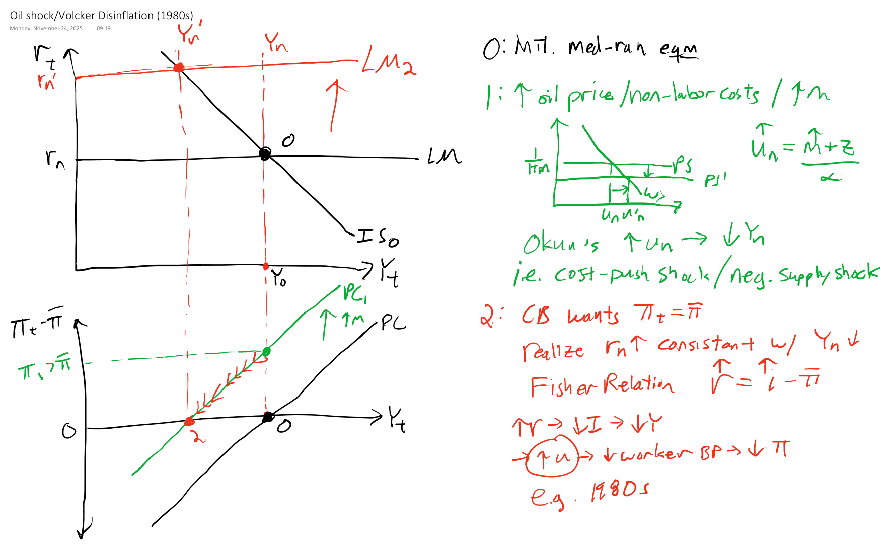
Experiments