Goods Market
by Professor Throckmorton
for Intermediate Macro
W&M ECON 304
Slides
Introduction
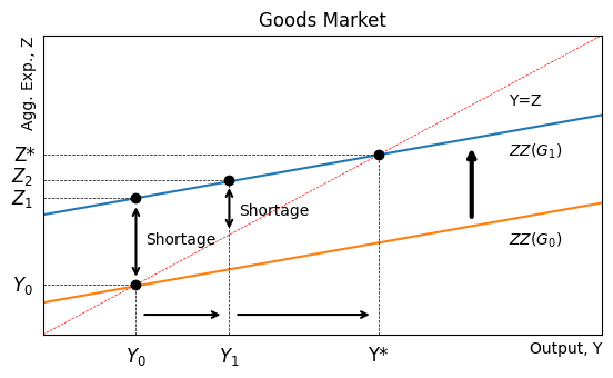
In the United States, consumption is the biggest component of GDP (in the expenditure approach).
In theory, when income goes up, consumption also increases and firms should respond by increasing production/output.
In this section, we will build an equilibrium model of output and aggregate expenditure where consumption is the main component.
Q: Why Consumption?
The consumption share of GDP is the largest component, larger than investment, government spending, and net exports.
The consumption share of GDP has increased over time.
Of course this is quite different between high and low income countries, but high income countries generally have a large share of consumption to GDP.
Consumption Function
Assume that aggregate consumption is a function of disposable income
is income, while is net tax revenue. Thus, is disposable income available to households.
Note: is net tax revenue because some households receive transfers from the government, e.g., Social Security payments and medical expenses paid via Medicare
Parameters
quantifies the fraction of current disposable income consumed by households
In the language of micro, we might call it the “consumption elasticity of disposable income”
In the language of macro, most people call it the “marginal propensity to consume” (MPC)
If there were low and high income households in the model, which do you think would have a higher average MPC?
is all consumption that is independent of current disposable income. Imagine if , then
households could dissave and consume out of their wealth, or
households could borrow against their wealth or future income to consume.
Aggregate Expenditure
In Ch. 2, the expenditure approach to GDP is
In the Solow growth model, we abstract from and and just had
In Part 2, we’ll work with a closed economy but consider changes in government spending, so
But we need to separate the expenditure (i.e., demand) side apart from the supply side, so let be aggregate supply/output and aggregate expenditure is
In equilibrium, , but there are disequilibria where
Disequilibrium Equilibrium
If , there is excess supply
Inventories would accumulate
Firms would probably decrease production
If , there is excess expenditure
Inventories would deplete
Firms would probably increase production
Either way, there is a tendency for to move toward , and thus is an equilibrium.
Endogenous Variables
So far, the model has variables
We’ve assumed is a function of and in equilibrium, , i.e., is a function of . These are known as endogenous variables.
However, we have not assumed functions for (yet). They are variables and could change, but they do not explicitly depend on or (yet). These are known as exogenous variables.
We can also treat parameters as exogenous variables, e.g., in the growth model we considered the effects of an increasing in the savings rate (a parameter).
For example, we could consider a financial crisis that reduces asset prices a reduction in househould wealth that is reflected by a decrease in . Another way to think of that is falling consumer confidence.
The Multiplier
The goods market in equilibrium has 3 equations
(a behavioral equation)
(an accounting identity)
(an equilibrium condition)
The main prediction this model makes is that an exogenous change in expenditure is multiplied into a larger endogenous change in equilibrium income/output.
That result is known as Income Multiplication (or the Keynesian Multiplier).
Multiplier Example
Suppose an Infrastructure Spending Bill is passed, or by
Aggregate expenditure, , directly increases by
Firms see higher demand for their outputs, e.g., increased orders for steel, cement, and construction equipment and vehicles, so they increase production, also by (on impact)
Households receive more income and they consume an additional
But is part of , so the loop repeats, i.e, the initial change in government spending multiplies into additional income over time.
| Multiplier Step | ||
|---|---|---|
| 0 | ||
| 1 | ||
| 2 | ||
| 3 | ||
| ... | ... | ... |
Since we’ve assumed , each additional step is adding a smaller amount to income/output.
Add up the column and we get
In other words, the multiplication process is represented by a geometric series (see the Wiki on that).
E.g., suppose and , then
is known as the government spending multiplier in this model.
Equilibrium Output
The goods market makes predictions about output/income, .
Q: How do changes in exogenous variables affect ?
Combining the goods markets equations (imposing that the model is in equilibrium)
Solving for equilibrium output,
are all exogenous parameters/variables at the moment.
Other Multipliers
From the solution for equilbrium output, we can see the government spending multiplier (which is the same as the earlier example)
An exogenous change in investment has the same multiplier
However, an exogenous change in net taxes has a different multiplier because households first choose consumption vs. savings and a change in net taxes has the opposite effect on consumption (than a change in governement spending).
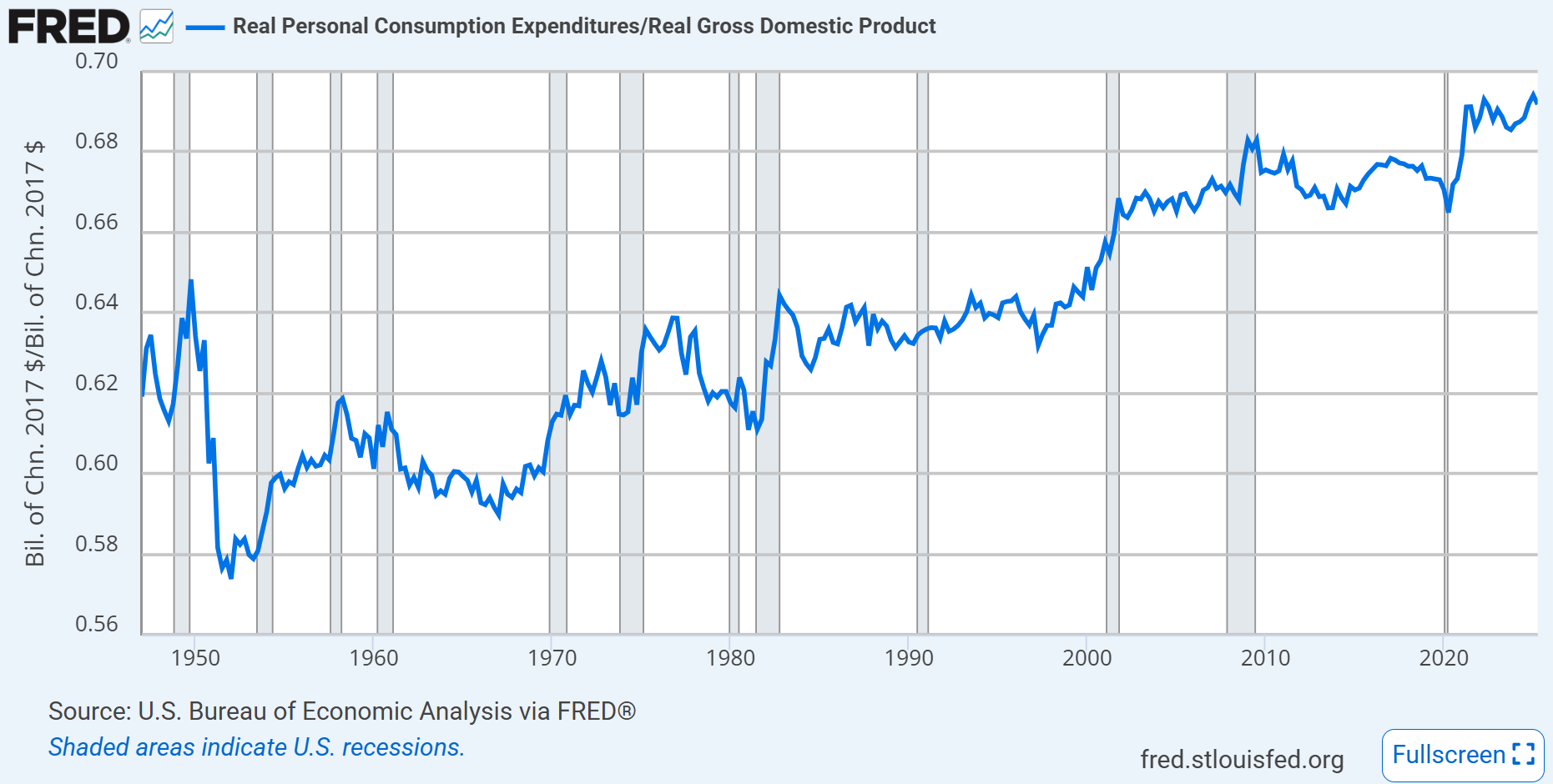
Goods Market Graph
The goods market graph will show output, , vs expenditure, .
Blanchard, Macroeconomics (9th Edition, 2025) introduces new notation for a graph of aggregate expenditure and calls it .
differentiates the aggregate expenditure function from particular realizations of aggregate expenditure that we label as just on the vertical axis.
Source
import numpy as np
import matplotlib.pyplot as plt
x = np.linspace(0, 40, 100)
y = 10 + x/3
plt.figure(figsize=(6.5, 3.5))
plt.plot(x, y)
plt.xlim(0, 30)
plt.ylim(0, 30)
plt.xlabel('Output, Y', loc='right')
plt.ylabel('Agg. Exp., Z', loc='top')
plt.title('Goods Market')
plt.grid()
plt.axhline(0, color='black',linewidth=0.5, ls='--')
# add line for 45 degree line from origin
plt.plot(x, x, color='red', linewidth=0.5, ls='--')
# add label for 45 degree line that says Y=Z
plt.text(25, 23, 'Y=Z', color='black')
# add label for expenditure line that says ZZ=C+I+G
plt.text(25, 16.5, 'ZZ=C+I+G', color='black')
# label the equilibrium point on the graph
plt.plot(15, 15, marker='o', color='black')
plt.text(15, 16, 'Equilibrium', fontsize=8, verticalalignment='bottom', horizontalalignment='right')
# put Y* = 15 on horizontal axis
plt.text(15.2, -1, 'Y*', fontsize=12, verticalalignment='top', horizontalalignment='center')
# put dashed vertical line between horizon axis and equilibrium point
plt.axvline(15, ymin=0, ymax=0.5, color='black', linewidth=0.5, ls='--')
# put horizontal dashed line between vertical axis and equilibrium point
plt.axhline(15, xmin=0, xmax=0.5, color='black', linewidth=0.5, ls='--')
plt.text(-1, 15.9, 'Z*', fontsize=12, verticalalignment='top', horizontalalignment='center')
# remove x and y labels and ticks
plt.xticks([]); plt.yticks([]);
Source
import numpy as np
import matplotlib.pyplot as plt
x = np.linspace(0, 40, 100)
y = 10 + x/3
plt.figure(figsize=(6.5, 3.5))
plt.plot(x, y)
plt.xlim(0, 30)
plt.ylim(0, 30)
plt.xlabel('Output, Y', loc='right')
plt.ylabel('Agg. Exp., Z', loc='top')
plt.title('Goods Market')
plt.grid()
plt.axhline(0, color='black',linewidth=0.5, ls='--')
# add line for 45 degree line from origin
plt.plot(x, x, color='red', linewidth=0.5, ls='--')
# add label for 45 degree line that says Y=Z
plt.text(25, 23, 'Y=Z', color='black')
# add label for expenditure line that says ZZ=C+I+G
plt.text(25, 16, 'ZZ=C+I+G', color='black')
# label the equilibrium point on the graph
plt.plot(15, 15, marker='o', color='black')
# put Y* = 15 on horizontal axis
plt.text(15, -1, 'Y*', fontsize=12, verticalalignment='top', horizontalalignment='center')
# put dashed vertical line between horizon axis and equilibrium point
plt.axvline(15, ymin=0, ymax=0.5, color='black', linewidth=0.5, ls='--')
# put horizontal dashed line between vertical axis and equilibrium point
plt.axhline(15, xmin=0, xmax=0.5, color='black', linewidth=0.5, ls='--')
plt.text(-1, 15.5, 'Z*', fontsize=12, verticalalignment='top', horizontalalignment='center')
# Put dot on 45 degree line at (5,5)
plt.plot(5, 5, marker='o', color='black')
# put dashed vertical line between horizon axis and aggregate expenditure line
plt.axvline(5, ymin=0, ymax=0.39, color='black', linewidth=0.5, ls='--')
# label the point (5,5) with Y_low
plt.text(5, -1, '$Y_{low}$', fontsize=12, verticalalignment='top', horizontalalignment='center')
# put dashed horizontal line between vertical axis and (5,5)
plt.axhline(5, xmin=0, xmax=5/30, color='black', linewidth=0.5, ls='--')
# label the point (5,5) with Y_low on the vertical axis
plt.text(-0.5, 5, '$Y_{low}$', fontsize=12, verticalalignment='center', horizontalalignment='right')
# put dashed horizontal line between vertical axis and aggregate expenditure line at X=5
plt.axhline(11.7, xmin=0, xmax=5/30, color='black', linewidth=0.5, ls='--')
# label the point (5,11.7) with Z_low on the vertical axis
plt.text(-0.5, 11.7, '$Z_{low}$', fontsize=12, verticalalignment='center', horizontalalignment='right')
# put a dot on the expenditure line at (5,11.7)
plt.plot(5, 11.7, marker='o', color='black')
# put a vertical curly brace between (5,5) and (5,11.7)
plt.annotate('', xy=(5, 5.3), xytext=(5, 11.1), arrowprops={'arrowstyle': '<->', 'lw':1.5})
# label the vertical arrow with "shortage"
plt.text(5.5, 8.5, 'Shortage', fontsize=10, verticalalignment='center')
# remove x and y labels and ticks
plt.xticks([]); plt.yticks([]);
# add y label at 20
plt.text(-0.5, 16.7, '$Z_{high}$', fontsize=12, verticalalignment='center', horizontalalignment='right')
# add x label at 20
plt.text(20, -1, '$Y_{high}$', fontsize=12, verticalalignment='top', horizontalalignment='center')
# put dashed vertical line between horizon axis and aggregate expenditure line at X=20
plt.axvline(20, ymin=0, ymax=16.7/30, color='black', linewidth=0.5, ls='--')
# put dashed horizontal line between vertical axis and aggregate expenditure line at Y=20
plt.axhline(16.7, xmin=0, xmax=20/30, color='black', linewidth=0.5, ls='--')
# put a vertical curly brace between (20,12) and (20,20)
plt.annotate('', xy=(20, 16.5), xytext=(20, 20), arrowprops={'arrowstyle': '<->', 'lw':1.5})
# label the vertical arrow with "surplus"
plt.text(20.5, 18.5, 'Surplus', fontsize=10, verticalalignment='center');
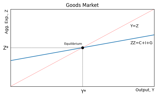
If output is below equilibrium, then expenditure exceeds output, .
In micro language, we would call that a shortage. But in macro, excess expenditure could be met with inventories (i.e., past production).
Excess expenditure creates an unplanned decrease in inventories, which is an incentive for firms to increase output.
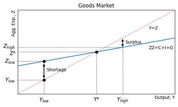
Experiment
Suppose from to .
An exogenous increase in will shift up the curve.
That creates excess expenditure, which depletes inventories.
Firms increase production to replenish inventories.
That leads to higher consumption and income multiplies until the new equilibrium is reached.
Source
import numpy as np
import matplotlib.pyplot as plt
x = np.linspace(0, 40, 100)
y = 12 + x/3
plt.figure(figsize=(6.5, 3.5))
plt.plot(x, y)
# Shift aggregate expenditure line down by 7 units
plt.plot(x, y-8.8)
plt.xlim(0, 30)
plt.ylim(0, 30)
plt.xlabel('Output, Y', loc='right')
plt.ylabel('Agg. Exp., Z', loc='top')
plt.title('Goods Market')
plt.grid()
plt.axhline(0, color='black',linewidth=0.5, ls='--')
# add line for 45 degree line from origin
plt.plot(x, x, color='red', linewidth=0.5, ls='--')
# add label for 45 degree line that says Y=Z
plt.text(25, 23, 'Y=Z', color='black')
# add label for expenditure line that says ZZ(G_0)
plt.text(25, 9, '$ZZ(G_0)$', color='black')
# add label for expenditure line that says ZZ(G_1)
plt.text(25, 18, '$ZZ(G_1)$', color='black')
# label the equilibrium point on the graph
plt.plot(18, 18, marker='o', color='black')
# put Y* = 15 on horizontal axis
plt.text(18, -1, 'Y*', fontsize=12, verticalalignment='top', horizontalalignment='center')
# put dashed vertical line between horizon axis and equilibrium point
plt.axvline(18, ymin=0, ymax=18/30, color='black', linewidth=0.5, ls='--')
# put horizontal dashed line between vertical axis and equilibrium point
plt.axhline(18, xmin=0, xmax=18/30, color='black', linewidth=0.5, ls='--')
plt.text(-1, 19, 'Z*', fontsize=12, verticalalignment='top', horizontalalignment='center')
# Put dot on 45 degree line at (5,5)
plt.plot(5, 5, marker='o', color='black')
# put dashed vertical line between horizon axis and aggregate expenditure line
plt.axvline(5, ymin=0, ymax=5/30, color='black', linewidth=0.5, ls='--')
# label the point (5,5) with Y_low
plt.text(5, -1, '$Y_0$', fontsize=12, verticalalignment='top', horizontalalignment='center')
# put dashed horizontal line between vertical axis and (5,5)
plt.axhline(5, xmin=0, xmax=5/30, color='black', linewidth=0.5, ls='--')
# label the point (5,5) with Y_low on the vertical axis
plt.text(-0.5, 5, '$Y_0$', fontsize=12, verticalalignment='center', horizontalalignment='right')
# put dashed horizontal line between vertical axis and aggregate expenditure line at X=5
plt.axhline(13.7, xmin=0, xmax=5/30, color='black', linewidth=0.5, ls='--')
# label the point (5,11.7) with Z_low on the vertical axis
plt.text(-0.5, 13.7, '$Z_1$', fontsize=12, verticalalignment='center', horizontalalignment='right')
# put a dot on the expenditure line at (5,11.7)
plt.plot(5, 13.7, marker='o', color='black')
# put a vertical curly brace between (5,5) and (5,11.7)
plt.annotate('', xy=(5, 5.5), xytext=(5, 13.1), arrowprops={'arrowstyle': '<->', 'lw':1.5})
# label the vertical arrow with "shortage"
plt.text(5.5, 9.5, 'Shortage', fontsize=10, verticalalignment='center')
# remove x and y labels and ticks
plt.xticks([]); plt.yticks([]);
# label horizontal axis at 10 Y_1
plt.text(10, -1, '$Y_1$', fontsize=12, verticalalignment='top', horizontalalignment='center')
# add vertical dashed line at Y_1
plt.axvline(10, ymin=0, ymax=15.5/30, color='black', linewidth=0.5, ls='--')
# add dot at (10,15) on the expenditure line
plt.plot(10, 15.5, marker='o', color='black')
# add vertical axis label at 15.5 Z_2
plt.text(-0.5, 17, '$Z_2$', fontsize=12, verticalalignment='top', horizontalalignment='right')
# add horizontal dashed line at Z_2
plt.axhline(15.5, xmin=0, xmax=10/30, color='black', linewidth=0.5, ls='--')
# add right arrrow between 5 and 11 on just above the horizontal axis
plt.annotate('', xy=(5.3, 2), xytext=(9.7, 2), arrowprops={'arrowstyle': '<-', 'lw':1.5})
# add right arrrow between 5 and 11 on just above the horizontal axis
plt.annotate('', xy=(10.3, 2), xytext=(17.7, 2), arrowprops={'arrowstyle': '<-', 'lw':1.5})
# put a vertical curly brace between (5,5) and (5,11.7)
plt.annotate('', xy=(10, 10.3), xytext=(10, 15), arrowprops={'arrowstyle': '<->', 'lw':1.5})
# label the vertical arrow with "shortage"
plt.text(10.5, 12.5, 'Shortage', fontsize=10, verticalalignment='center');
# add a big up arrow on the right side between the two aggregate expenditure lines
plt.annotate('', xy=(23, 11.5), xytext=(23, 19), arrowprops={'arrowstyle': '<-', 'lw':3});
Savings
Define private saving as disposable income not consumed, .
Define public saving as net tax revenue minus government spending,
Note that in a goods market equilibrium .
Subtract from both sides and move to the left hand side
Thus, in equilibrium investment equals saving.
In an open economy, investment would also depend on foreign savings, i.e.,