Phillips Curve
by Professor Throckmorton
for Intermediate Macro
W&M ECON 304
Slides
Summary
Phillips Curve: negative relationship b/t inflation () and unemployment (),
i.e., if central bank wants lower inflation, then the economy must make the sacrifice of higher unemploymentTesting the Phillips Curve in the United States
1960s: low and stable inflation, i.e.,
1970 to 1995: big positive oil price shocks,
1996 to 2019: Fed achieves goal of
Phillips Curve can be expressed relative to the medium-run equilibrium
Starting from Labor Market
The Phillips Curve comes from the Labor Market
and the medium-run equilibrium determines the natural rate of unemployment.
Right now shows up, but we want relationship between and . Recall for Chapter 2
Adding time and the inflation rate
Want: relationship b/t and
Substitute WS into PS
Add time subscripts and divide by
where and are constant w.r.t. time
Note from definition of that
and similarly
Combine equations
Combine results from steps 3. and 4.
That’s difficult to interpret. It is a nonlinear equation, e.g., multiplies .
What is worker bargaining power, ? Remember . Let’s assume
Substitute out worker bargaining power function
This is still nonlinear.
Approximate linearly
We’ll use natural logs to approximate the Phillips curve linearly. In disciplines that use dynamic models, e.g., economics, physics, and biology, this is known as log-linearizing.
Recall some facts about logs from math class:
Apply properties of logs
Apply
Note . Also , and the same is true for , , and , i.e., they are relatively small.
Apply .
This is equation 8.2 in Blanchard, Macroeconomics (9th Edition, 2025).
Phillips Curve (PC)
Properties of the Phillips Curve all relate to Labor Market
: If workers expect prices to rise, then they will demand higher wages, which leads firms to eventually raise prices. Thus the expectation is self-filling.
: If firms markup of price above cost rises, then prices are growing faster.
: Any policies that increase worker bargaining power will allow workers to demand high wages, driving up costs and prices.
An Experiment
We defined as the markup, but we can also interpret it as any non-labor costs.
In the 1970s United States, we saw a 5-fold increase in the price of oil.
That kind of shock is known as a “cost-push” shock, which is inflationary, and shifts up the PC.
If inflation remains high for too long, then people begin to expect higher inflation, which shifts up the PC again due to a wage-price spiral.
Source
# plot a downward sloping line with slope -1 and y-intercept 10
import matplotlib.pyplot as plt
import numpy as np
x = np.linspace(0, 10, 100)
y = 4 - x
plt.plot(x, y)
plt.xlabel('$u$')
plt.ylabel('$\\pi$')
# Move ylabel to top and rotate it vertically
plt.gca().yaxis.set_label_coords(-.05, .95)
plt.gca().yaxis.label.set_rotation(0)
# move xlabel to right
plt.gca().xaxis.set_label_coords(.95, -0.05)
# set plot dimensions to 6.5 inches by 4 inches
plt.gcf().set_size_inches(6.5, 4)
# add label for intercept with text "$\pi^e + m + z$" at (0, 5)
plt.text(-.7, 5.5, 'intercept: \n $\\pi^e + m + z$', fontsize=10, verticalalignment='bottom')
# add label for intercept with text "$u_n$" at (5, 0)
plt.text(2, -.5, '$u_n$', fontsize=12, horizontalalignment='center')
# plot a line with intercept at 7 and slope -1
plt.plot(x, 6 - x, linestyle='--', color='red')
# plot vertical dashed line at x=3
plt.axvline(x=2, linestyle='--', color='black')
# add y label at 2 for "\pi_0"
plt.text(-0.2, 2, '$\\pi_0$', fontsize=12, verticalalignment='center')
# set lower y limit to 0 and lower x limit to 0
plt.xlim(left=0,right=4)
plt.ylim(bottom=0,top=7)
# add label for slope with text "slope: \alpha" at (3,1)
plt.text(3, .5, 'slope: $-\\alpha$', fontsize=10, verticalalignment='bottom', horizontalalignment='right')
# add up arrow between lines with text "cost-push shock"
plt.annotate('', xy=(3, 2.9), xytext=(3, 1.1), arrowprops=dict(arrowstyle='->'))
plt.text(3.1, 1.5, 'cost-push shock', fontsize=10, verticalalignment='center')
# add horizontal dashed line at y=2 from x= 0 to x=2
plt.hlines(y=2, xmin=0, xmax=2, colors='black', linestyles='--')
# add horizontal dashed line at y=4 from x= 0 to x=2
plt.hlines(y=4, xmin=0, xmax=2, colors='black', linestyles='--')
# add y label at 4 for "\pi_1"
plt.text(-0.2, 4, '$\\pi_1$', fontsize=12, verticalalignment='center')
# remove all tick labels
plt.xticks([]); plt.yticks([]);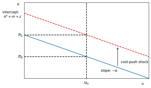
An increase in shifts up the PC
At , inflation rises from to
We know from labor market that .
Thus tells us how much must rise for inflation to return to .
The PC would also shift up if
Testing the PC
The Phillips Curve is a testable hypothesis (i.e., linear regression)
The test is whether is statistically significantly positive when controlling for expected inflation.
: current inflation
: expected inflation (measured by market/survey data)
: sensitivity of wages demanded to the business cycle
: current unemployment (summarizes the business cycle)
: markup of price over cost
: other things that affect worker bargaining power
Expected Inflation
In practice, there are two popular measures of expected inflation
Survey data: ask people for their inflation forecasts, e.g., Philadelphia Fed Survey of Professional Forecasters
Market data: observe difference in bond prices on nominal bonds and inflation-indexed bonds. Inflation-index bonds are officially called Treasury Inflation Protected Securities (TIPS).
In theory, we can simplify the model with an assumption about expected inflation
Assume expected inflation is anchored to some value, .
Assume expected inflation is adapting to recent data, .
Source
# Libraries
from fredapi import Fred
import pandas as pd
# Read data
fred_api_key = pd.read_csv('fred_api_key.txt', header=None).iloc[0,0]
fred = Fred(api_key=fred_api_key)
# get unemployment rate series
data = fred.get_series('UNRATE').to_frame(name='Unemployment Rate')
# append CPI inflation rate to data
data['CPI'] = fred.get_series('CPIAUCSL')
# reindex data to QE by using last value of quarter
data = data.resample('QE').last()
# calculate inflation rate as percentage change from same quarter last year
data['CPI Inflation Rate'] = data['CPI'].pct_change(periods=4) * 100

# plot unemployment rate and CPI inflation rate
fig, ax1 = plt.subplots(figsize=(8.5,4))
ax1.plot(data.index, data['Unemployment Rate'], '-b')
ax1.plot(data.index, data['CPI Inflation Rate'], '-r')
ax1.set_xlabel('Year')
# relocate legend to inside upper right and make horizontal
ax1.legend(['Unemployment Rate', 'CPI Inflation Rate'], loc='lower right', ncol=2)
# add grid lines
ax1.grid()
# add % to ylabels
ax1.yaxis.set_major_formatter(plt.FuncFormatter(lambda y, _: '{:.0f}%'.format(y)))
# set xlims to 1947-01-01 to 2025-9-30
ax1.set_xlim(pd.Timestamp('1949-04-01'), pd.Timestamp('2025-09-30'));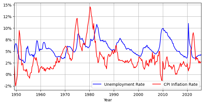
Inflation is low and stable around 1% in early-mid 1960s.
It is safe to assume that at that time expected inflation was anchored to 1%.
The 1960s
Notice inflation in early 1960s is about (low and stable)
Let’s assume people are forming expectations given what they observe:
i.e., expectations are anchored at some value
Phillips curve becomes
If the assumption that worker bargaining power is countercyclical, i.e., , is good, then Phillips curve predicts:
Source
# take data 2 and resample to annual frequency using average
data_annual = data.resample('YE').mean()
# create subset of data_annual for years 1960-1969
data_annual_1960s = data_annual[(data_annual.index.year >= 1960) & (data_annual.index.year < 1970)]
# plot scatter plot of inflation rate vs unemployment rate for 1960s only, set marker size to 10
plt.figure(figsize=(6,4))
plt.scatter(data_annual_1960s['Unemployment Rate'], data_annual_1960s['CPI Inflation Rate'], c='k', s=10)
plt.xlabel('Unemployment Rate')
plt.ylabel('CPI Inflation Rate')
# label each point with year
for i, year in enumerate(data_annual_1960s.index.year):
    plt.text(data_annual_1960s['Unemployment Rate'].iloc[i]-.06, data_annual_1960s['CPI Inflation Rate'].iloc[i]-.3, str(year)[2:4])
# add grid lines
plt.grid()
# move points on top of grid lines
plt.gca().set_axisbelow(False)
# add % to labels
plt.gca().xaxis.set_major_formatter(plt.FuncFormatter(lambda x, _: f'{x}%'))
plt.gca().yaxis.set_major_formatter(plt.FuncFormatter(lambda y, _: f'{y}%'))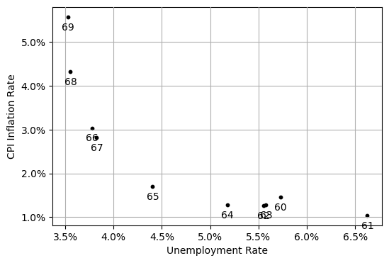
In 1960s, obvious negative relationship between inflation and unemployment.
Relationship looks nonlinear since the unemployment rate cannot fall further.
Source
# create subset of data_annual for years 1970-1995
data_annual_1970s_1990s = pd.DataFrame(data_annual[(data_annual.index.year >= 1970) & (data_annual.index.year < 1996)])
# plot scatter plot of inflation rate vs unemployment rate for 1970-1995 only, set marker size to 10
plt.figure(figsize=(6,4))
plt.scatter(data_annual_1970s_1990s['Unemployment Rate'], data_annual_1970s_1990s['CPI Inflation Rate'], c='k', s=10)
plt.xlabel('Unemployment Rate')
plt.ylabel('CPI Inflation Rate')
# label each point with year
for i, year in enumerate(data_annual_1970s_1990s.index.year):
    plt.text(data_annual_1970s_1990s['Unemployment Rate'].iloc[i]-.09, data_annual_1970s_1990s['CPI Inflation Rate'].iloc[i]-.7, str(year)[2:4])
# add grid lines
plt.grid()
# move points on top of grid lines
plt.gca().set_axisbelow(False)
# add % to labels
plt.gca().xaxis.set_major_formatter(plt.FuncFormatter(lambda x, _: f'{x}%'))
plt.gca().yaxis.set_major_formatter(plt.FuncFormatter(lambda y, _: f'{y}%'))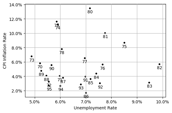
After 1960s, no clear relationship between inflation and unemployment.
Q: Is the Phillips curve irrelevant?
A: It depends on how people form expectations.
1970 to 1995
Big positive oil price shocks cause inflation to rise rapidly
People form expectations given what they observe:
i.e., expectations have become unanchored from a particular value
Phillips curve becomes
where .
The Phillips curve predicts:
Source
# create column in data_annual_1970s_1990s for year for first difference of inflatinon rate
data_annual_1970s_1990s['Inflation Rate First Difference'] = data_annual_1970s_1990s['CPI Inflation Rate'].diff()
# plot scatter plot of inflation rate vs unemployment rate for 1970-1995 only, set marker size to 10
plt.figure(figsize=(6,4))
plt.scatter(data_annual_1970s_1990s['Unemployment Rate'], data_annual_1970s_1990s['Inflation Rate First Difference'], c='k', s=10)
plt.xlabel('Unemployment Rate')
plt.ylabel('Percentage Point Change in Inflation Rate')
# add grid lines
plt.grid()
# move points on top of grid lines
plt.gca().set_axisbelow(False)
# add % to labels
plt.gca().xaxis.set_major_formatter(plt.FuncFormatter(lambda x, _: f'{x}%'))
# fit a linear trend line to the scatter plot
import numpy as np
# import linear regression from statsmodels
import statsmodels.api as sm
# create regressors with constant
ur = data_annual_1970s_1990s['Unemployment Rate']
X = pd.DataFrame({
    'const': 1,
    'ur': ur,
})
y = data_annual_1970s_1990s['Inflation Rate First Difference']
model = sm.OLS(y[1:-1], X[1:-1]).fit()
x_fit = np.linspace(X['ur'].min(), X['ur'].max(), 100)
y_fit = model.predict(pd.DataFrame({  'const': 1, 'ur': x_fit}))
plt.plot(x_fit, y_fit, '-r', label='Best Linear Fit')
plt.legend();
# add equation for trend line parameter estimates to plot in red text
slope = model.params['ur']
intercept = model.params['const']
eqstr = f'\\Delta \\pi_t = {intercept:.1f} - {abs(slope):.1f} u_t'
plt.text(8, -1.3, f'${eqstr}$', color='red');
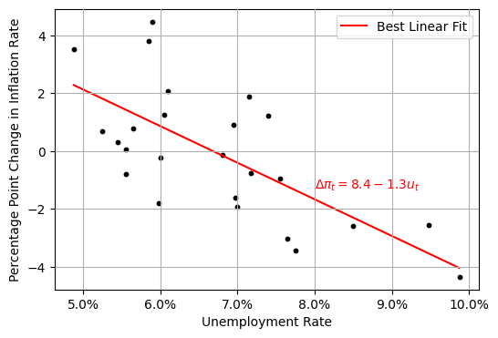
Each point is a year between 1970 and 1995.
The vertical axis is the first difference of the inflation rate.
The -value on the slope is close to zero, so the slope is statistically significantly different from zero.
1996 to 2019
Source
# create subset of data_annual for years 1996-2019
data_annual_1990s_2010s = pd.DataFrame(data_annual[(data_annual.index.year >= 1996) & (data_annual.index.year <= 2019)])
# create column in data_annual_1990s_2010s for year for first difference of inflatinon rate
data_annual_1990s_2010s['Inflation Rate First Difference'] = data_annual_1990s_2010s['CPI Inflation Rate'].diff()
# plot scatter plot of inflation rate vs unemployment rate for 1996-2019 only, set marker size to 10
plt.figure(figsize=(6,4))
plt.scatter(data_annual_1990s_2010s['Unemployment Rate'], data_annual_1990s_2010s['CPI Inflation Rate'], c='k', s=10)
plt.xlabel('Unemployment Rate')
plt.ylabel('Inflation Rate')
# add grid lines
plt.grid()
# move points on top of grid lines
plt.gca().set_axisbelow(False)
# add % to labels
plt.gca().xaxis.set_major_formatter(plt.FuncFormatter(lambda x, _: f'{x}%'))
# fit a linear trend line to the scatter plot
import numpy as np
# import linear regression from statsmodels
import statsmodels.api as sm
# create regressors with constant
ur = data_annual_1990s_2010s['Unemployment Rate']
X = pd.DataFrame({
    'const': 1,
    'ur': ur,
    })
y = data_annual_1990s_2010s['CPI Inflation Rate']
model = sm.OLS(y[1:-1], X[1:-1]).fit()
x_fit = np.linspace(X['ur'].min(), X['ur'].max(), 100)
y_fit = model.predict(pd.DataFrame({  'const': 1, 'ur': x_fit}))
plt.plot(x_fit, y_fit, '-r', label='Best Linear Fit')
plt.legend();
# add equation for trend line parameter estimates to plot in red text
slope = model.params['ur']
intercept = model.params['const']
eqstr = f'\\Delta \\pi_t = {intercept:.1f} - {abs(slope):.1f} u_t'
plt.text(8, 2, f'${eqstr}$', color='red');
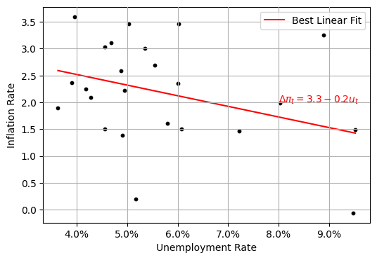
In early 1990s, Fed settles on inflation target
Fed (mostly) successfully achieves and maintains target from 1996 to 2019
Inflation expectations are anchored,
Thus, the best model for the PC is the same as 1960s
Medium-run Equilibrium
Substitute and into Phillips curve
Solve for
The equilibrium/natural unemployment rate increases if
the markup increases
worker B.P. increases (not because of the business cycle)
the sensitivity of wages demanded to an increase in B.P. falls
Want: Phillips Curve relative to eqm so we can study how inflation responds to events/policy changes
Substitute into Phillips curve
Rearranging/simplifying
Suppose (as supported by data from 1996 to 2019, and hopefully from 2024 onward)
Interpretation
If (eqm), then is stable at the target
If (not eqm), then is below the target
If (not eqm), then is above the target
The last two, if sustained for a significant time, may erode the central bank’s credibility and possibly unanchor expectations.