FRED in Python
Summary
This Jupyter Notebook contains cells with examples of getting, plotting, and transforming macroeconomic time-series data. The following content is also available as slides.
FRED API Key
There are a lot of different sources for economic time-series data, and FRED is an easy place to start.
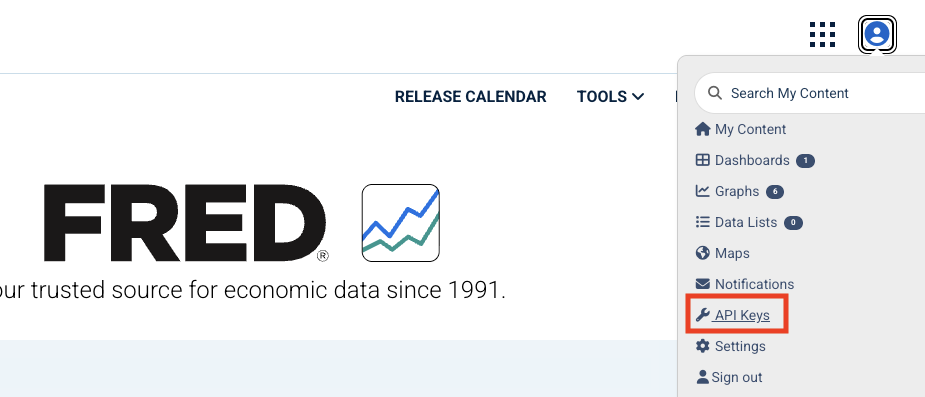
You will need to create an account on FRED, request an API Key, and store the key in a file, e.g.,
fred_api_key.txt, in the same folder as this Notebook. It’s good practice to keep your API Key secret.
Reading data
First, let’s get and plot data on U.S. real GDP.
The
fredpypackage contains the methodseriesto get the data from FRED.
# Import packages
import fredpy as fp
# Setup access to FRED
with open('../fred_api_key.txt') as f:
    fp.api_key = f.read().strip()
# Get data from FRED
rgdp = fp.series('GDPC1').data
# Print data
print(f'number of rows/quarters = {len(rgdp)}')
print(rgdp.head(2))
print(rgdp.tail(2))
number of rows/quarters = 318
date
1947-01-01 2182.681
1947-04-01 2176.892
Freq: QS-OCT, Name: value, dtype: float64
date
2026-01-01 24180.419
2026-04-01 24269.613
Freq: QS-OCT, Name: value, dtype: float64
Jan 1 corresponds to the first quarter (Q1) of the year, and Apr 1 is Q2, etc ...
Units are billions of chained 2017 dollars (see Real Gross Domestic Product notes).
print(f'...')formats a string to display (see f-strings).print(rgdp.head(2))shows the first two rows ofrgdp, andprint(rgdp.tail(2))shows the last two rows.
Datetime
We can reference values with a datetime, e.g.,
rgdp['2026-04-01'].
# Latest Real GDP value (with formatting)
print(f'Latest Real GDP value (2026Q2) = \
${rgdp['2026-04-01']:,.0f}B')
Latest Real GDP value (2026Q2) = $24,270B
In the
printstatement,:,.0fadds a comma delimiter and removes the decimal places.
Plotting data
Here we use the matplotlib library again (see Jupyter Notebook).
import matplotlib.pyplot as plt
_, ax = plt.subplots(figsize=(6.5,2.5))
ax.plot(rgdp);
ax.set_title('Real GDP');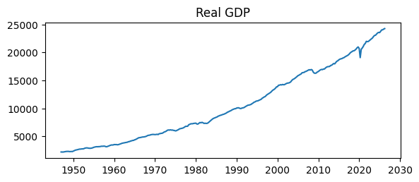
ax.plot automatically puts the datetimes on the horizontal axis.
What’s wrong with that plot?
The values on the vertical axis have no units.
An absence of grid lines makes it difficult to read values from the series.
Let’s fix those issues with ax.yaxis.set_major_formatter and ax.grid.
fig, ax = plt.subplots(figsize=(6.5,2.5))
ax.plot(rgdp)
ax.set_title('Real GDP')
ax.yaxis.set_major_formatter('${x:,.0f}B')
ax.grid()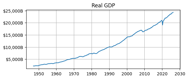
Transforming data
We don’t usually look at the time series of real GDP in levels like that. Why?
We usually care about the business cycle, i.e., is GDP growing (in an expansion) or shrinking (in a recession)?
We can see the little wiggles in the level above, but there is a better way to visualize those ups and downs.
When GDP is reported, we might read the latest value, or we would look at recent growth rates. Growth rates will highlight the expansions and recessions clearly.
Percent Change
Let’s calculate the percent change from the same quarter one year ago.
rgdpis an object with a method for percent change,pct_change().Since the data has a quarterly frequency, we want the percent change from 4 quarters in the past, e.g.,
rgdp.pct_change(4).
# Real GDP Growth Rate (percent change from 4 quarters ago)
rgdp_growth = 100*rgdp.pct_change(4)

# Latest Real GDP value
print(f'2026Q2 real GDP Year over Year Growth Rate = \
{rgdp_growth['2026-04-01']:.2f}%')
2026Q2 real GDP Year over Year Growth Rate = 2.10%
Let’s create a function to shade recessions.
# Recession shading function
def recessionplot(ax, rec):
    ax.fill_between(rec.index,0,1,
        where=(rec == 1),color='gray',alpha=0.25,
        transform=ax.get_xaxis_transform(),zorder=0
    )
Defines
recessionplot(ax, rec)to add recession shading to an existing axis,ax, using a recession-indicator seriesrec.fill_between()shades periods whererec == 1gray with 25% opacity;transform=ax.get_xaxis_transform()makes the shading span the full height of the plot.zorder=0places the recession shading behind the plotted data.
# Get recession indicator data from FRED
rec = fp.series('USREC').data
# Plot Real GDP growth rate
fig, ax = plt.subplots(figsize=(6.5,2.5))
ax.plot(rgdp_growth)
recessionplot(ax, rec)
ax.set_title('Real GDP Year over Year Growth Rate')
ax.yaxis.set_major_formatter('{x:.0f}%')
ax.grid()
ax.autoscale(tight=True)
ax.set_xlim(left=rgdp_growth.index[0]);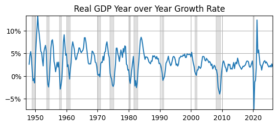
Now that we have transformed real GDP into something we can interpret, what do we see? (i.e., “eyeball” econometrics)
Real GDP growth rates usually vary between and .
They are more often positive than negative.
After 1985, the local maximums are around , down from around before 1985.
The last two declines (in 2008 and 2020) in real GDP were the biggest since the beginning of the sample (1947).
Average
Let’s compare the average real GDP growth rate before and after 1985 using the method mean and referencing a range of values between two datetimes, e.g., rgdp_growth['1947-01-01':'1984-10-01'].
# Take average across subsamples
mean_pre85 = rgdp_growth['1947-01-01':'1984-10-01'].mean()
mean_post85 = rgdp_growth['1985-01-01':'2026-04-01'].mean()

# Display means
print('Avg. Real GDP Growth')
print(f'  1947 through 1984 = {mean_pre85:.1f}%')
print(f'  1985 through 2026 = {mean_post85:.1f}%')
Avg. Real GDP Growth
1947 through 1984 = 3.7%
1985 through 2026 = 2.7%
Real GDP growth has declined on average by 1 percentage point after 1985, which is significant when compounding that growth rate over roughly 40 years.
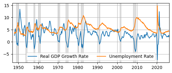
For another plot example, let’s create a figure with two time-series and a legend.
# Get unemployment rate data from FRED
unemp = fp.series('UNRATE').data
# Plot data
fig, ax = plt.subplots(figsize=(6.5,2.5))
ax.plot(rgdp_growth, label = 'Real GDP Growth Rate')
ax.plot(unemp, label = 'Unemployment Rate')
ax.legend(ncol=2)
ax.grid()
recessionplot(ax, rec)
ax.set_xlim(left=rgdp_growth.index[0],right=rgdp_growth.index[-1]);
Conclusion
We used fredpy to get data from FRED, matplotlib to plot it, and transformed it so that we could summarize and interpret it.