IS-LM Model
by Professor Throckmorton
for Intermediate Macro
W&M ECON 304
Slides
Introduction
The goods market predicts equilibrium output/income, .
The money market predicts the equilibrium interest rate, .
The goal is to build a general equilibrium model where there is joint determination of the endogenous variables in equilibrium.
In the money market, money demand is already a function of income, .
We can modify the goods market so that investment is endogenous to the interest rate, e.g., if the interest rate falls, borrowing is cheaper, and firms invest more in new capital.
LM Curve
LM is an abbreviation for Liquidity preference (i.e., money demand) equals Money supply.
The IS-LM model will live in the interest rate vs. output space, where each axis corresponds to an equilibrium outcome in one of the markets.
In the money market, we assumed that the central bank targets the interest rate regardless of the level of money demand, which is a function of income. See the experiment at the end of the money market chapter.
Thus, the LM curve is a flat line at the central bank’s interest rate target, , which shifts up or down if the bank changes the target.
Source
import numpy as np
import matplotlib.pyplot as plt
x = np.linspace(1, 40, 100)
plt.figure(figsize=(5, 3))
# plot a downward sloping line
plt.plot(x, 20*x/x);
# set ylimits to 0 to 40
plt.ylim(0, 40);
# remove the x and y tick labels
plt.xticks([]); plt.yticks([]);
# label the x axis as Money (M) and the y axis as Interest Rate (i)
plt.xlabel('Output, Y', loc='right')
plt.ylabel('i', rotation=0, loc='top')
# add ylabel i^* at y = 20
plt.text(-2, 20, '$i^*$', fontsize=10, verticalalignment='bottom', horizontalalignment='right');
# add label to horizontal line "LM"
plt.text(38, 22, 'LM', fontsize=10, verticalalignment='bottom', horizontalalignment='right');
# put dashed vertical line between horizontal axis and LM curve at x = 10
plt.axvline(10, ymin=0, ymax=1/2, color='black', linewidth=0.5, ls='--')
# add label to vertical line "Y_1"
plt.text(10, -2, '$Y_1$', fontsize=10, verticalalignment='top', horizontalalignment='center');
# put dashed vertical line between horizontal axis and LM curve at x = 30
plt.axvline(30, ymin=0, ymax=1/2, color='black', linewidth=0.5, ls='--')
# add label to vertical line "Y_2"
plt.text(30, -2, '$Y_2$', fontsize=10, verticalalignment='top', horizontalalignment='center');
# add arrow pointing right between the two vertical dashed lines
plt.arrow(12, 5, 16, 0, head_width=1, head_length=1, fc='black', ec='black');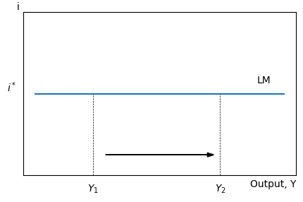
Suppose output/income increases.
In the money market, money demand increases, which would usually lead to a higher interest rate.
However, the central bank increases the money supply to maintain the interest rate at their target .
Thus, the LM curve is flat.
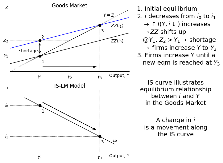
IS Curve
IS stands for Investment equals Savings, which is one way to describe the equilibrium in the goods market.
Relaxing the assumption of exogenous investment in the goods market, let’s instead suppose the investment function is , i.e., it is endogenous to revenue and the interest rate.
If , then firms receive more revenue and increase investment, .
If , then it’s cheaper to borrow and firms increase investment, .
Now, if the central bank changes its interest rate target, then investment with change and affect aggregate expenditure and equilibrium output.
Source
# create a figure with 2 subplots, one on top of the other
fig, ax = plt.subplots(2, 1, figsize=(5, 6))
# Label the top figure "Goods Market" and the bottom figure "IS-LM Model"
ax[0].set_title('Goods Market')
ax[1].set_title('IS-LM Model')
# increase the vertical space between the two subplots
plt.subplots_adjust(hspace=0.3)
# in the top subplot, plot a 45 degree line from the origin to (40, 40)
x = np.linspace(0, 40, 100)
ax[0].plot(x, x, color='black', linewidth=1, ls='--')
# label the 45 degree line "Y=Z"
ax[0].text(35, 35, '$Y=Z$', fontsize=10, verticalalignment='bottom', horizontalalignment='right');
# set the top subplot axis limits to 0 to 40 on both axes
ax[0].set_xlim(0, 40)
ax[0].set_ylim(0, 40)
# on the top subplot, plot an upward sloping line from (0, 10) to (40, 30)
ax[0].plot(x, 0.5*x + 5, color='black', linewidth=1)
# label the upward sloping line "ZZ($i_0$)"
ax[0].text(38, 18, '$ZZ(i_0)$', fontsize=10, verticalalignment='bottom', horizontalalignment='right');
# on the top subplot, plot an upward sloping line from (0, 20) to (40, 40)
ax[0].plot(x, 0.5*x + 15, color='blue', linewidth=1)
# label the upward sloping line "ZZ($i_0$)"
ax[0].text(38, 28, '$ZZ(i_1)$', fontsize=10, verticalalignment='bottom', horizontalalignment='right');
# label the x axis as Output (Y) and the y axis as Expenditure (Z)
ax[0].set_xlabel('Output, Y', loc='right')
ax[0].set_ylabel('Z', rotation=0, loc='top')
# on the top subplot, add a point at the intersection of the 45 degree line and the first upward sloping line
ax[0].plot(10, 10, 'o', color='black')
# label the point 1
ax[0].text(11, 5, '1', fontsize=10, verticalalignment='bottom', horizontalalignment='center');
# on the top subplot, add a point at the intersection of the 45 degree line and the second upward sloping line
ax[0].plot(30, 30, 'o', color='black')
# label the point 3
ax[0].text(31, 25, '3', fontsize=10, verticalalignment='bottom', horizontalalignment='center');
# on the top subplot, add a vertical two-headed arrow between the two upward sloping lines above point 1
ax[0].annotate('', xy=(10, 11), xytext=(10, 19),
             arrowprops=dict(arrowstyle='<->', color='black', linewidth=1));
# label the arrow "shortage"
ax[0].text(3, 12, 'shortage', fontsize=10, verticalalignment='bottom', horizontalalignment='left');
# on the top subplot, label the xaxis at 10 as Y_1
ax[0].text(10, -2, '$Y_1$', fontsize=10, verticalalignment='top', horizontalalignment='center');
# on the top subplot, label the xaxis at 30 as Y_2
ax[0].text(30, -2, '$Y_3$', fontsize=10, verticalalignment='top', horizontalalignment='center');
# on the top subplot, add vertical dashed line from the xaxis to the point 1
ax[0].plot([10, 10], [0, 10], color='black', linewidth=0.5, ls='--');
# on the top subplot, add vertical dashed line from the xaxis to the point 3
ax[0].plot([30, 30], [0, 30], color='black', linewidth=0.5, ls='--');
# on the top subplot, add a dot at x = 10 on the top upward sloping line
ax[0].plot(10, 20, 'o', color='black')
# label the dot 2
ax[0].text(11, 21, '2', fontsize=10, verticalalignment='bottom', horizontalalignment='center');
# on the top subplot, add a horizontal dashed line between point 2 and x = 20
ax[0].plot([10, 20], [20, 20], color='black', linewidth=0.5, ls='--');
# on the top subplot, add a vertical dashed from the xaxis to y = 20
ax[0].plot([20, 20], [0, 20], color='black', linewidth=0.5, ls='--');
# on the top subplot, label the xaxis at 20 as Y_2
ax[0].text(20, -2, '$Y_2$', fontsize=10, verticalalignment='top', horizontalalignment='center');
# On the top subplot, add an arrow that points right from x = 10 to 30 at y = 5
ax[0].arrow(11, 3, 17, 0, head_width=1, head_length=1, fc='black', ec='black');
# on the bottom subplot, plot a downward sloping line from (0, 40) to (40, 0)
x = np.linspace(5, 35, 100)
ax[1].plot(x, -x + 40, color='black', linewidth=1)
# on the bottom subplot, label the yaxis "i" and the xaxis "Y"
ax[1].set_xlabel('Output, Y', loc='right')
ax[1].set_ylabel('i', rotation=0, loc='top')
# on the bottom subplot, set the x axis limits to 0 to 40 and the y axis limits to 0 to 40
ax[1].set_xlim(0, 40)
ax[1].set_ylim(0, 40)
# on the bottom subplot, label yaxis at 30 as i_0
ax[1].text(-0.5, 30, '$i_0$', fontsize=10, verticalalignment='center', horizontalalignment='right');
# on the bottom subplot, label yaxis at 10 as i_1
ax[1].text(-0.5, 10, '$i_1$', fontsize=10, verticalalignment='center', horizontalalignment='right');
# on the bottom subplot, label the downward sloping line "IS"
ax[1].text(36, 6, '$IS$', fontsize=10, verticalalignment='bottom', horizontalalignment='right');
# on the bottom subplot, add a point at the intersection of the downward sloping line and y = 30
ax[1].plot(10, 30, 'o', color='black')
# label the point 1
ax[1].text(11, 25, '1', fontsize=10, verticalalignment='bottom', horizontalalignment='center');
# on the bottom subplot, add a point at the intersection of the downward sloping line and y = 10
ax[1].plot(30, 10, 'o', color='black')
# label the point 3
ax[1].text(31, 5, '3', fontsize=10, verticalalignment='bottom', horizontalalignment='center');
# on the bottom subplot, add a vertical dashed line at x = 10
ax[1].plot([10, 10], [0, 40], color='black', linewidth=0.5, ls='--');
# on the bottom subplot, add a vertical dashed line at x = 30
ax[1].plot([30, 30], [0, 40], color='black', linewidth=0.5, ls='--');
# on the bottom subplot, label xaxis at 10 as Y_1
ax[1].text(10, -2, '$Y_1$', fontsize=10, verticalalignment='top', horizontalalignment='center');
# on the bottom subplot, label xaxis at 30 as Y_3
ax[1].text(30, -2, '$Y_3$', fontsize=10, verticalalignment='top', horizontalalignment='center');
# on the bottom subplot, add horizontal dashed line at y = 30 between the y axis and the point 1
ax[1].plot([0, 10], [30, 30], color='black', linewidth=0.5, ls='--');
# on the bottom subplot, add horizontal dashed line at y = 10 between the y axis and the point 3
ax[1].plot([0, 30], [10, 10], color='black', linewidth=0.5, ls='--');
# on bottom subplot, add downward sloping arrow parallel to IS line from point 1 to point 3
ax[1].arrow(11, 32, 17, -17, head_width=1, head_length=1, fc='black', ec='black');
# on top subplot, add horizontal line between yaxis and point 2 at y = 20
ax[0].plot([0, 10], [20, 20], color='black', linewidth=0.5, ls='--');
# on top subplot, add horizontal line between yaxis and point 2 at y = 10
ax[0].plot([0, 10], [10, 10], color='black', linewidth=0.5, ls='--');
# on top subplot, label yaxis at 10 as Y_1
ax[0].text(-0.5, 10, '$Y_1$', fontsize=10, verticalalignment='center', horizontalalignment='right');
# on top subplot, label yaxis at 20 as Z_2
ax[0].text(-0.5, 20, '$Z_2$', fontsize=10, verticalalignment='center', horizontalalignment='right');
# remove ticks and tick labels from both subplots
ax[0].set_xticks([]); ax[0].set_yticks([]);
ax[1].set_xticks([]); ax[1].set_yticks([]);
# remove top and right side of box on both subplots
ax[0].spines['top'].set_visible(False)
ax[0].spines['right'].set_visible(False)
ax[1].spines['top'].set_visible(False)
ax[1].spines['right'].set_visible(False)
# create a text box next to the figure that says "1. initial equilibrium"
fig.text(.95, 0.9,
    r'1. Initial equilibrium' '\n'
    r'2. $i$ decreases from $i_0$ to $i_1$' '\n'
    r'   $\rightarrow \uparrow I(Y,i\downarrow)$ increases' '\n'
    r'   $\rightarrow ZZ$ shifts up' '\n'
    r'   @$Y_1$, $Z_2>Y_1\rightarrow$ shortage' '\n'
    r'   $\rightarrow$ firms increase $Y$ to $Y_2$' '\n'
    r'3. Firms increase $Y$ until a' '\n'
    r'   new eqm is reached at $Y_3$'
    ,fontsize=14, va='top',ha='left');
# create a text box below the last one that says "IS curve illustrates equilibrium in the Goods Market"
fig.text(1.2, 0.5,
    r'IS curve illustrates' '\n'
    r'equilibrium relationship' '\n'
    r'between $i$ and $Y$' '\n'
    r'in the Goods Market'
    ,fontsize=14, va='top',ha='center');
fig.text(1.2, 0.3,
    r'A change in $i$' '\n'
    r'is a movement along' '\n'
    r'the IS curve'
    ,fontsize=14, va='top',ha='center');
Shifts
LM shifts when the central bank changes its interest rate target:
LM shifts up for contractionary monetary policy, and .
LM shifts down for expansionary monetary policy, and .
IS shifts when something else affects aggregate expenditure, , besides the interest rate:
, , or shift up and right
, , or shift down and left