Economic Growth
by Professor Throckmorton
for Intermediate Macro
W&M ECON 304
Slides
World Bank Data
Growth economics is primarily concerned with how the average standard of living is changing over time.
GDP per person is a widely available measure of standard of living.
But volatile exchange rates and differences in price levels make it difficult to compare countries.
Thus, we use purchasing power parity adjusted GDP, which corrects for those differences.
The World Bank reports PPP GDP per capita for many countries.
# World bank data
import wbdata

# Select indicator and countries
indicator = {"NY.GDP.PCAP.PP.KD": "PPP_GDP_per_capita"}
countries = ["USA", "CHN", "IND", "JPN", "VNM", "ETH"]

# Fetch data from World Bank
data = wbdata.get_dataframe(indicator, country=countries)
Source
# Rearrange DataFrame: index as year, columns as countries
data = data.unstack(level='country')
# Remove the indicator name from column names
data.columns = data.columns.droplevel(0)
# Round to nearest integer and remove missing numbers
data = data.round().dropna()
# Change country names
data = data.rename(columns={'United States': 'USA', 'Viet Nam': 'Vietnam'})
# Display final DataFrame
print(data.head(2))
print(data.tail(2))
country China Ethiopia India Japan USA Vietnam
date
1990 1667.0 874.0 2203.0 35272.0 44379.0 2468.0
1991 1798.0 778.0 2179.0 36372.0 43742.0 2561.0
country China Ethiopia India Japan USA Vietnam
date
2023 22687.0 2758.0 9302.0 45859.0 74159.0 13546.0
2024 23846.0 2884.0 9817.0 46097.0 75492.0 14415.0
Source
ax = data.plot(title="Real GDP per person (2017 int'l $, log scale)", figsize=(6.5, 3))
# Add grid and remove x label
ax.grid(); ax.set_xlabel(''); ax.autoscale(tight=True);
# Move legend
ax.legend(loc='upper center', bbox_to_anchor=(0.5, -0.1), ncol=3)
# Improve y-axis labels and ticks
ax.set_yscale('log', base=2);
ax.yaxis.set_major_formatter('${x:,.0f}')
ax.set_yticks([500 * (2 ** i) for i in range(10)]);
ax.set_ylim(300, 100000);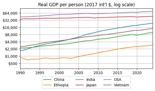
USA and Japan have more than double the income per person than China, Vitenam, or India
Regardless, the gap between these high income and emerging economies is shrinking, i.e., they are converging
Like China/Vietnam/India, income per person in Ethiopia has increased as rapidly over the last 20 years.
# Compute GDP per person growth rates
import numpy as np
logdata = np.log(data)
logdata_growth = 100*logdata.diff(1)
Source
# Plot
ax = logdata_growth[['USA', 'Japan']].plot(title='GDP per person growth rate (%)', figsize=(6.5, 3))
# Add grid and remove x label
ax.grid(); ax.set_xlabel(''); ax.autoscale(tight=True);
# Move legend
ax.legend(loc='upper center', bbox_to_anchor=(0.5, -0.1), ncol=3);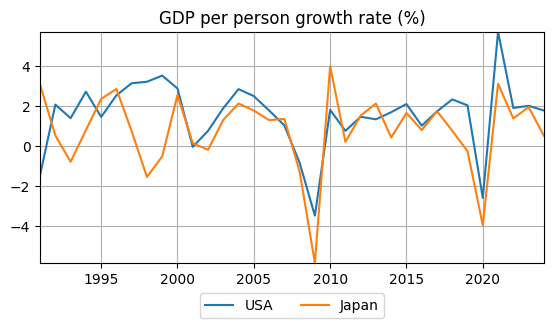
Growth rates in the USA are higher on average than in Japan.
Growth rates in the USA are less volatile than in Japan.
USA and Japan’s growth rates are mostly positively correlated, especially when the USA is in recession.
Source
# Plot
ax = logdata_growth[['China', 'India','Vietnam']].plot(title='GDP per person growth rate (%)', figsize=(6.5, 3))
# Add grid and remove x label
ax.grid(); ax.set_xlabel(''); ax.autoscale(tight=True);
# Move legend
ax.legend(loc='upper center', bbox_to_anchor=(0.5, -0.1), ncol=3);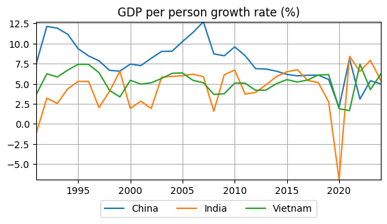
Growth rates in China were much higher than India or Vietnam up until about 2015.
All three countries maintained high positive growth rates through the global financial crisis.
Recent growth rates are more similar than in the past, particulary because China has slowed down.
Source
# Plot
ax = logdata_growth[['USA', 'China','Ethiopia']].plot(title='GDP per person growth rate (%)', figsize=(6.5, 3))
# Add grid and remove x label
ax.grid(); ax.set_xlabel(''); ax.autoscale(tight=True);
# Move legend
ax.legend(loc='upper center', bbox_to_anchor=(0.5, -0.1), ncol=3);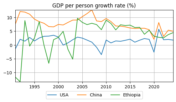
China has grown more quickly than the USA.
Despite Ethiopia being low income, it grew as fast as China in the 2000s.
Growth rates in China and Ethiopia have fallen together, but they are still higher than the USA.
Growth Facts
The following table is from Blanchard, Macroeconomics (9th Edition, 2025), Chapter 10, Page 203
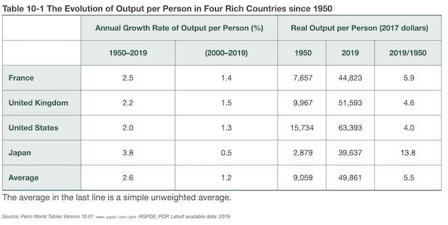
“There has been a large increase in output per person.” (compounding)
“There has been a convergence of output per person across countries.” (convergence)
“The growth rate of output per person has declined.” (falling productivity growth)
Production Function
The core economic growth model is attributed to economist Robert Solow and is often called the “Solow Model” (1950s).
At the heart of the Solow Model is the production function, which relates aggregate output to the factors of production, primarily, capital, technology, and labor, e.g., .
The Cobb-Douglas production function is
where is aggregate output (which we measure with GDP), is capital, is technology, is labor, is the output elasticity of capital, and is the output elasticity of labor.
This function is used to model production. For example, in the context of a factory, could be the number of trucks produced, the factory size, and the number of employees. could reflect bench or assembly line production.
Diminishing Returns to Capital (or Labor)
If we double the amount of capital, but not labor, then it is reasonable to assume output will less than double. Why?
Let’s assume . Suppose we increase by a factor (e.g., would double capital)
If , then increases by less than , which is the case of diminising returns to capital.
Likewise, there are diminishing returns to labor if .
Returns to Scale
Suppose we scale up both and by a factor
There are three possible returns to scale for the Cobb-Douglas production function.
If , there are constant returns to scale (CRS)
If , there are increasing returns to scale.
If , there are decreasing returns to scale.
E.g., if a firms’s production function is CRS, then doubling the amount of both capital and labor will double its output.
Output per Worker
Assuming (we will revisit this later) and CRS (), the Cobb-Douglas production function becomes
Divide both sides by to get
Thus, output per worker is just a function of the capital stock available to each worker, where the output elasticty to capital is .
The San Francisco Fed estimates to be about 0.40 over the last decade (see Total Factor Productivity).
Source
import numpy as np
import matplotlib.pyplot as plt

alpha = 0.4
k = np.linspace(0, 8, 200)
y = k ** alpha

fig, ax = plt.subplots(figsize=(6, 3))
ax.plot(k, y)
ax.set_xlabel("$K/N$ (capital per worker)")
ax.set_ylabel("$Y/N$ (output per worker)")
ax.grid()
ax.autoscale(tight=True);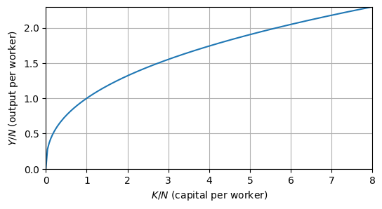
The production function is concave.
If capital is zero, then output is zero.
Increasing capital increases output (per worker).
Increasing capital increases output at a diminishing rate.
i.e., capital accumulation alone should not sustain growth
Source
y2 = 2 * k ** alpha

# Plot
fig, ax = plt.subplots(figsize=(6, 3))
ax.plot(k, y, label=r"$y = k^\alpha$", color="blue")
ax.plot(k, y2, label=r"$y = 2k^\alpha$", linestyle="--", color="green")

# Arrow to indicate upward shift
ax.annotate(
    '', xy=(5, 3.6), xytext=(5, 2),
    arrowprops=dict(arrowstyle="->", color="black", lw=1.5)
)

# Labels and legend
ax.set_xlabel(r"$K/N$ (capital per worker)")
ax.set_ylabel(r"$Y/N$ (output per worker)")
ax.legend()
ax.grid(True)
ax.autoscale(tight=True)
plt.show()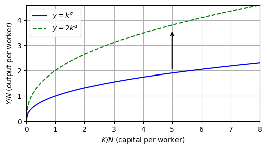
If a technology doubles output, then the curve shifts up, twice as high as the original curve.
If technology were to continue growing each year, then technological progress should sustain economic growth.